

Hi you! ☻⋆˚✿˖°
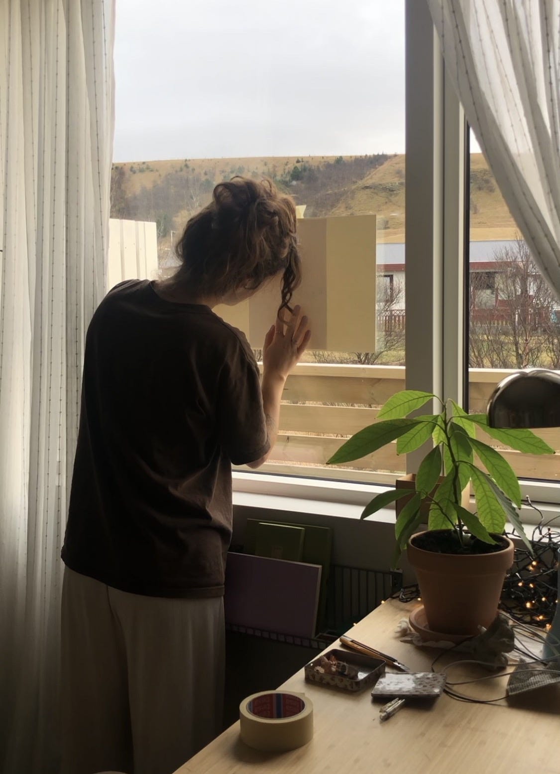
Snow arrived to Hvolsvöllur, creating the perfect conditions to stay indoors painting all day long 𓂃𓂃
While I wait for the watercolors to dry I will write about the process of my solo exhibition happening this December at Nakano. I will tell you about my experience painting with kuretake watercolours.
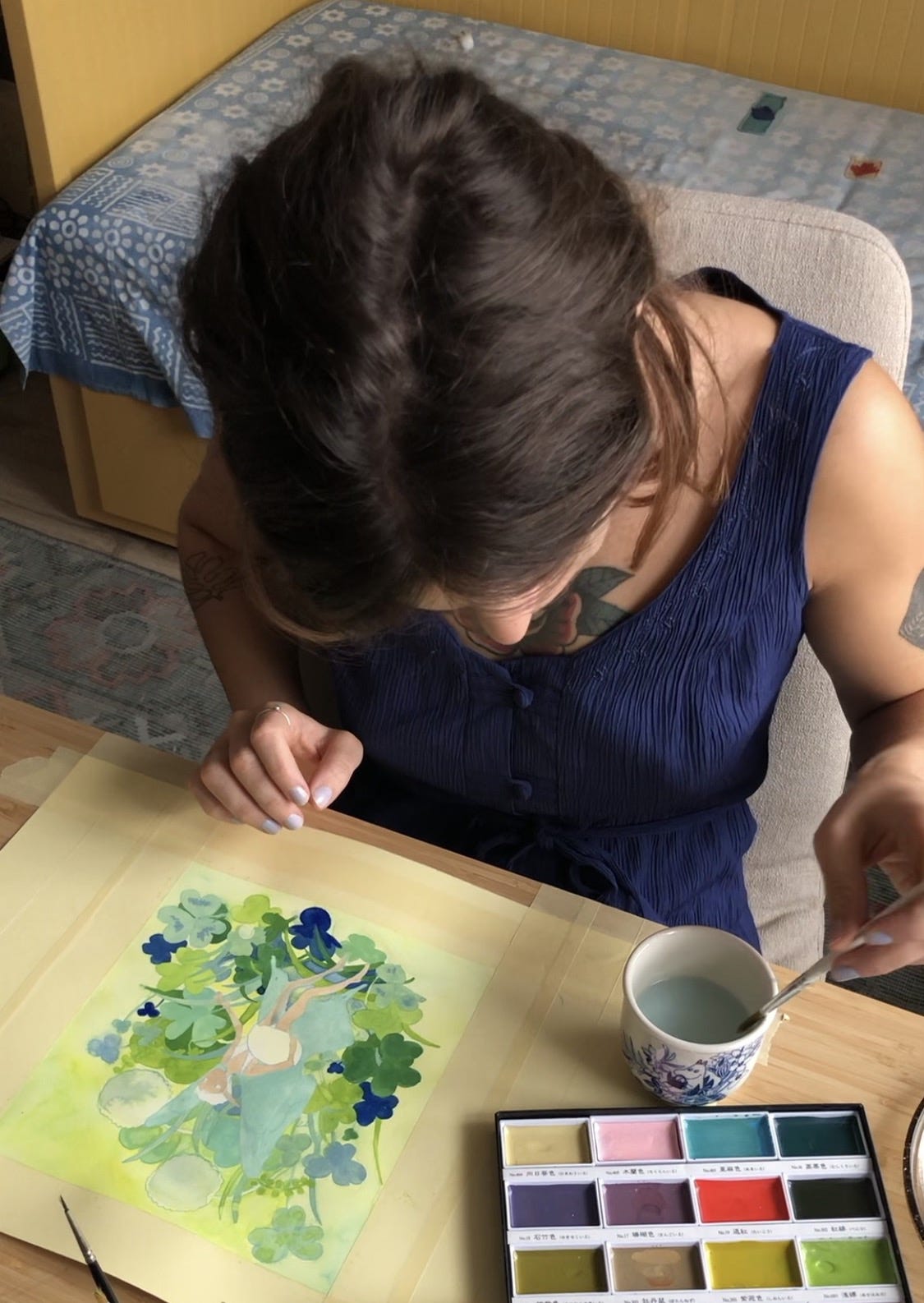
Let’s start at the beginning - Paper .ᐟ
Since my originals will be for sale I ought to invest on a quality paper. My favorite watercolour paper is this, it’s a very smooth paper with just the right tone of white that won’t bend. But unfortunately the store in Reykjavík didn’t have it for sale anymore so I bought this one instead:
- Acquarello Watercolour, Grana Satinata, Hot Pressed, 300gr ⋆˚✿˖°
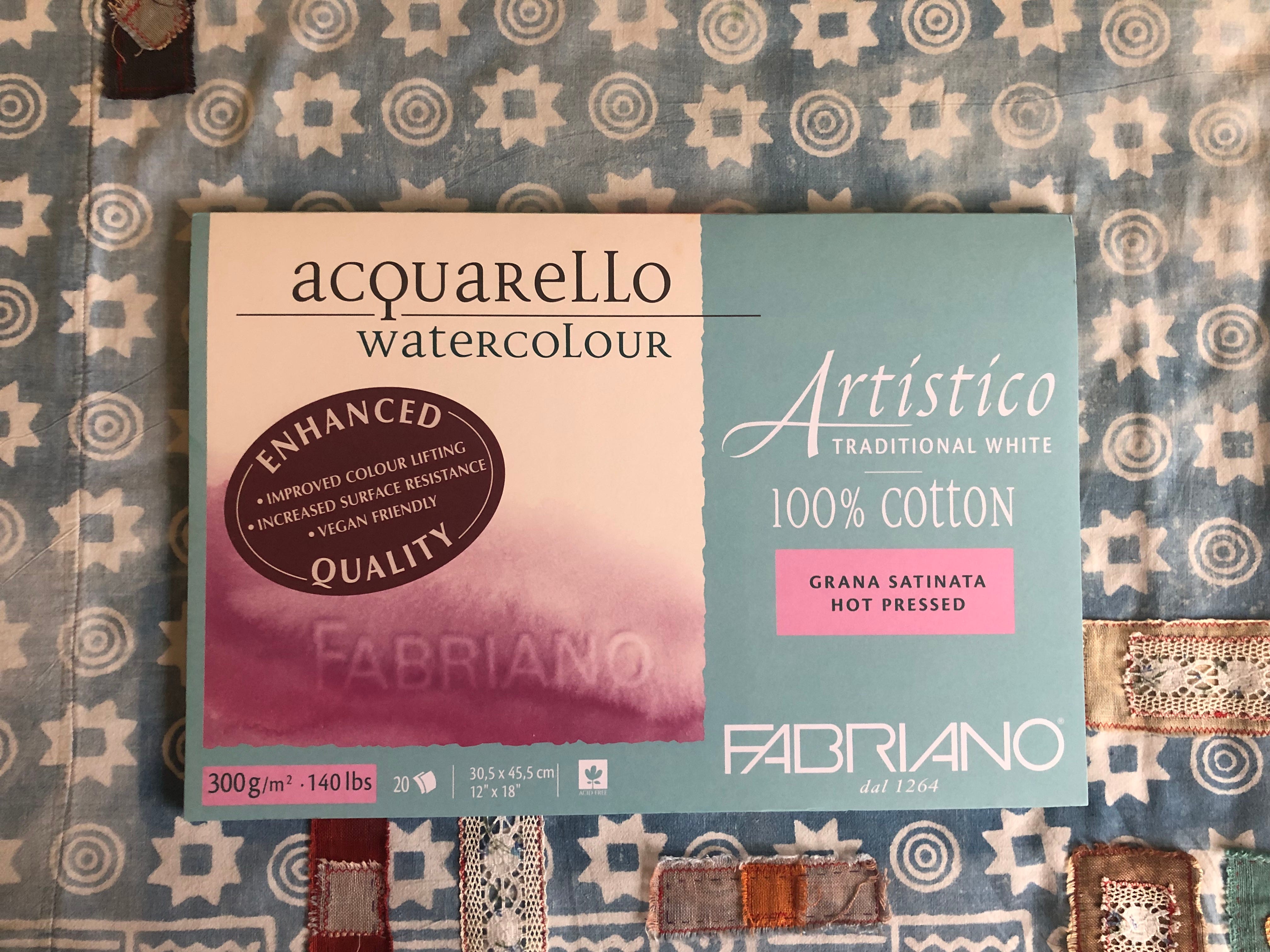
This paper bends a bit but it went back to its original shape after completely drying.
I chose hot pressed because the paper is smooth and fine, this is ideal for my detailed drawings. If it has texture, the smallest detail won’t be as I wish because of a little ‘‘mountain’’ in the paper ( ◡̀_◡́)ᕤ
This is the fun part - Watercolours 𖦹
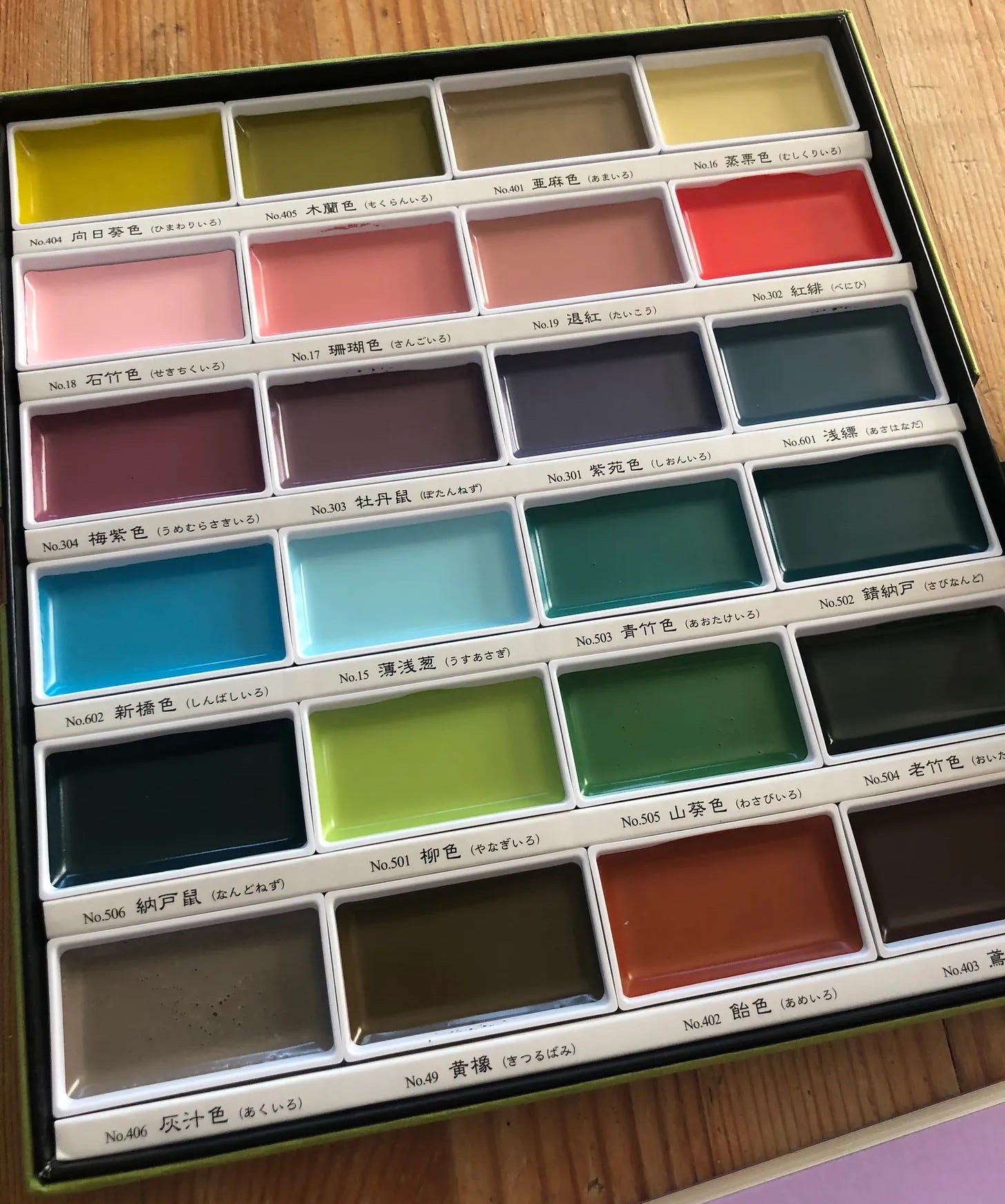
I’m using kuretake watercolors to paint all of my pieces. These creamy little boxes have such beautiful, intense and rich colors!! Here’s a picture for you to appreciate them. I know, they are so pretty!
The painting process 🎧ྀི♪⋆.✮
I want everything in this exhibition to suggest that we’re in a magical world.
I went deep into understanding colors, their meaning, what sensations they convey.
In the book Interaction of Color, Joseph Albers writes that ‘‘In visual perception a color is almost never seen as it really is — as it physically is (…) And in the end, the study of color is the study of ourselves.’’
Since the theme of my exhibition is (my own) Metamorphosis ~ the process of transformation in two or more distinct stages. Persistence.
My metamorphosis from chaotic and raw to elegant and considered.
The colors must be a mirror to myself. This has been a good therapeutic exercise of looking within, and writing about it also helps with decisions.
That being said, the colors must be fun, the vegetation must be whimsical and the fairy’s expression has to spark joy… and giggles ‧˚♪ ₊˚⊹
The yellow base sets the overall tone and color scheme of the painting. I wanted this piece to be bubbly and optimistic! Nothing like yellow with this specific greenish blue to brighten my mood.


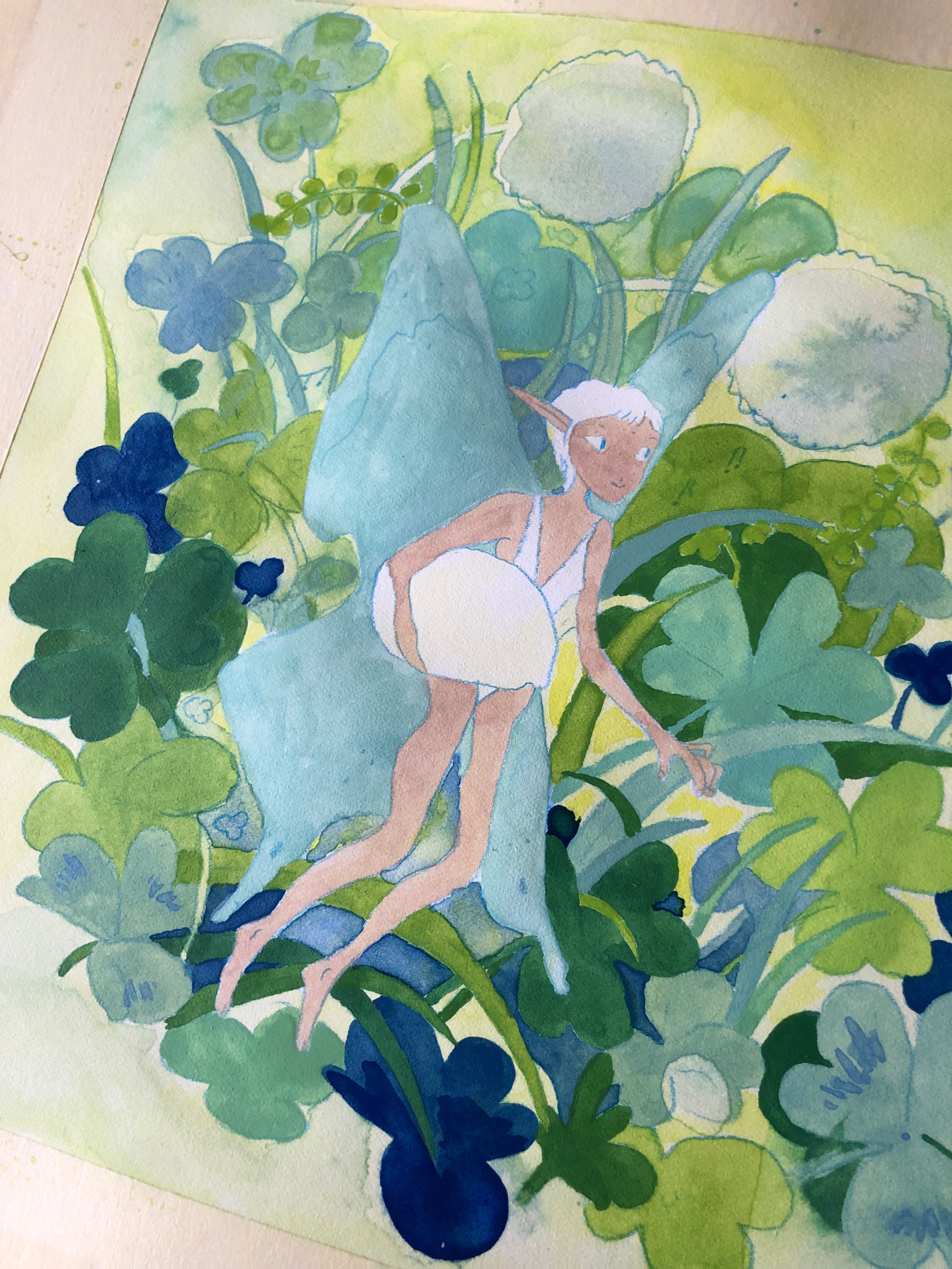
I eventually ruined it (obviously) because I didn’t stop when I must have had.
With watercolours you have to know when to stop!
‘‘But how do I know when to stop?’’
You don’t. You try, you realize that you went too far, you cry (you don’t have to cry) get frustrated…
The next time you do it, you already know when to stop, from experience.
This only means that the more you draw and paint, the better you will be. So if you’re thinking about making another reel or dealing with your inbox, don’t - go practice instead.
It’s awesome that you read this entire letter ♡
I will now retrace the illustration to give it another try
See you next time? 𐔌՞. .՞𐦯